 Tackling Movable Type templates and CSS for the first time can be daunting. The MT default templates contain four kinds of code: CSS, HTML, MT tags, and Javascript.
If you're new to all this, you're about to learn that it pays to make a careful study of the code. Once you understand the way it works together, it's pretty easy to modify your MT templates to display almost any design you want.
Understanding the Divisions
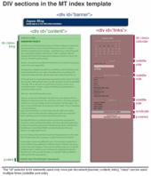
Let's start by taking a look at what the different sections are and what the code does. I've broken apart the default template in an illustrated way. This isn't exactly a Movable Type tutorial, but it does point out where the divs are and what the tags look like in code and rendered in the browser.
This diagram shows where the div sections of the MT index template begin and end. (Please click to open a larger version in a new window.)
 Positioning with CSS
Want to move these three major sections to different locations on your page? Start by modifying the style sheet entries for #banner, #content, and #links.
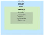
Most of the positioning elements in this stylesheet are margins and padding. Note that when a margin or padding is specified with four values, the order is always TOP, RIGHT BOTTOM, LEFT. If only one value is specified, it applies to all four sides equally.
Almost anything on your page can have margins and/or padding added to it--images, forms, tables, paragraphs. Usually margin and padding are mixed in with the formatting elements that control color, fonts and so on. In the examples, I removed the formatting controls as they rarely cause confusion once you understand positioning.
Margins and padding are nearly interchangable. The main difference is that if you've specified a background color in your style, padding adds an edge of the background color, but margins do not.
There are several other positioning elements that are crucial to the overall layout of the MT default index page.
Position:absolute This is used by the #content element and it means that #content ignores where other things are on the page and puts itself where you specify based on margins of its "parent." In the default MT index template, the #content element is absolute in relation to the
tag. It's 225 px from the left margin, which leaves room for the left-side links section.
Position:relative This is the opposite of position:absolute. Relative positioning lets you shift an element on the page in relation to the things around it.
Float:left Floats are a little confusing, but if you've ever wrapped text around an image in Word, PageMaker, or a similar program, you'll understand the basic concept. In CSS, anything can be floated--images, paragraphs, headings, divs. Float can create some surprising and bad layouts, partly because not all browsers (including IE6) support them well, so read up on float before you start using it. And be prepared to test in many browsers to make sure it looks OK.
Width:200 This is used in the #links style in the default template. It ensures that the links section doesn't overflow into the #content section (which is 225 pixels from the left margin)
One final note. The difference between # and .
#name -- ID -- used only once per document
.name -- CLASS -- used as many times as needed in the document
This is not everything there is to know about positioning. For more details, check out Eric A. Meyer's comprehensive (but a little daunting) CSS books. For up-to-date online help, Google for CSS positioning tutorial.
A Positioning Example
To move the "links" column to the right instead of the left (MT's default), you need to edit #content and #links in the style sheet. In #content you change the position to relative and add a float and a width. You also change the values for the margin. In #links, you remove the width and adjust padding:

Links on LEFT (the MT default)
| 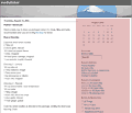
Links on RIGHT (modified)
|
#content {
position:absolute;
margin-right:20px;
margin-left:225px;
margin-bottom:20px;
}
#links {
padding:15px;
width:200px;
}
|
#content {
float:left;
postion:relative;
width:70%;
margin-right:15px;
margin-bottom:20px;
margin-left: 15px;
}
#links {
padding:15px;
}
|
 Formatting the Blog Entry
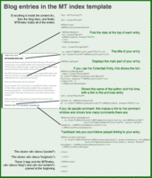
After you have the major divisions sorted, you can focus on formatting your blog entries. Changing the way the blog entry looks requires a mix of the style sheet, special MT tags and HTML.
There are three things you might want to do to format your blog entry:
- Adjust the text displayed (Format the date as 2003-08-14) - MT Tags
- Change the fonts, color, spacing, etc., of the text - CSS
- Move the text to another place in the entry - HTML template
All the sections of the entry (the date, title, body, extended entry link, posted, comments link, and trackback) follow a similar pattern: to change the text displayed take a look at the options for the MT tag and change the template; to change the way the text looks, change the CSS and to move the data around within the entry, cut and paste within the template HTML.
Let's take one section of the entry as an example:
Entry Date
To change the text of the date, you change the <MTEntryDate format="%x"> by substituting something else for the %x. All the date format codes are in the MT Manual.
To change the font and color of the date, you edit date in the style sheet.
date {
font-family:palatino, georgia, times new roman, serif;
font-size: large;
color: #333;
border-bottom:1px solid #999;
margin-bottom:10px;
font-weight:bold;
}
To change the location of the date within the entry, cut these lines from the HTML, and paste them where you want the date to appear. These lines must stay inside the MTEntry.
<MTDateHeader>
<h2 class="date">
<$MTEntryDate format="%x"$>
</h2>
</MTDateHeader>
More Study Examples
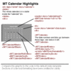
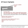
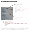
I took the screenshots from Jason Cha's Japan Blog, Philip Hill's Grandfather Philip, and my own Media Tinker weblog. Thanks to Bob McDonald, Rudolf Ammann, Gary Lawrence Murphy and Olivier Thereaux for their helpful suggestions.
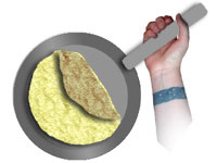 The fancy finish: Place the filling in a line across the center of the omelet, perpendicular to the handle of the pan. On the side of the pan with the handle, fold over 1/3 of the omelet. Then grab the handle with an underhand grip, slide the pan right up against the serving plate and roll the omelet out of the pan, completing the fold as you serve. Be careful not to burn yourself on the pan.
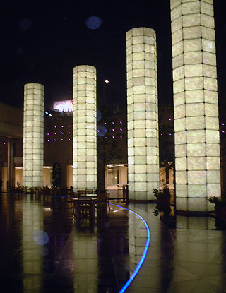
 Edo, the city that became Tokyo, was founded in 1603, so Tokyo is celebrating its 400th anniversary this year.

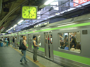


 Boys don't make passes at girls who wear glasses.
 Summer fireworks festivals are a tradition dating back hundreds of years. Originally for the powerful elite, there were public fireworks along the banks of Sumidagawa in 1733.
Recent Comments