February 20, 2007
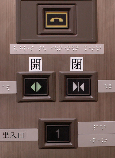
Relabelled
I guess the icons on the buttons aren’t clear enough to indicate open & close.
Posted by kuri at February 20, 2007 08:56 AMComments
Better safe than sorry I guess!
Posted by: John Lampard on February 22, 2007 09:29 PMGreat capture. I think the kanji is much more informative.
I’ve often wondered why the Japanese needed to learn a whole bunch of new icons (especially on computer interfaces) when they could choose from thousands of known icons that didn’t take up much screen real estate.
Posted by: M Sinclair Stevens on February 26, 2007 12:24 AMPost a comment

