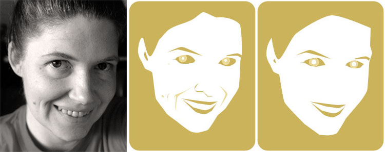
 This week I’ve been working on illustrations for two different projects. For one, I needed a model. I browsed my collection of photos looking for someone turned at the correct angle, smiling and looking at the camera. No such luck. So I picked up the camera, tilted, smiled and snapped.
Then I went to work in Photoshop, using the pen tool and many layers to create a block-print look face. I made a very simplified version (at right below), using the placement of my features and the general shape of my face, ignoring details and eliminating curves, wrinkles and my nose. It was pretty much the look I wanted to achieve, so I submitted it for comments to the Collectik crew.
And then I decided to try making a more realistic stylised version of me. I added the laugh lines and moles, followed the curve of my face more closely, and gave myself a nose and slightly more accurate eyes.

The reference photo; me, realistically stylised; the submitted face.
I truly enjoy abstracting the essence of something in to shapes and lines. Simpifying an object requires you to focus on positive and negative space, form, shadow. Which details tell the story? What can be discarded? Which lines must be 100% accurate? Which ones can be adjusted and how? Can or should you add details that aren’t there?
It’s especially interesting when you work with your face as the object. I’m sure a psychologist would have a field day with the details I included or didn’t…
Posted by kuri at June 02, 2006 12:06 AMFab… very Wahol. (Sorry did I just make you cringe?)
Posted by: T on June 2, 2006 01:34 PM